Flight status
EXISTING PRODUCT REDESIGN
responsive web
A state-aware hierarchy redesign for WestJet's Flight Status.
A state-aware hierarchy redesign for WestJet's Flight Status.
A state-aware hierarchy redesign for WestJet's Flight Status.
A responsive redesign of WestJet's Flight Status experience with an objective to make flight changes clear, actionable, and responsive across devices. Not a visual rebrand.
A responsive redesign of WestJet's Flight Status experience with an objective to make flight changes clear, actionable, and responsive across devices. Not a visual rebrand.


TIMELINE
May 2026
2 weeks
2 weeks
role
Sole Product Designer
Self-initiated
Self-initiated
Scope
Information hierarchy
Responsive web
STATE SYSTEM DESIGN
EXISTING BRAND DESIGN SYSTEM
TOOLS

Perplexity
Research
Research

ChatGPT
Product Reasoning + Prompt Refining
Product Reasoning + Prompt Refining
Figma + MCP
Figma, FigJam, Figma Make
Design, Ideation
Design, Ideation

Claude Design
Claude Code
Design System + UI
Targeted refinement
Design System + UI
Targeted refinement
TL ; DR
TL ; DR
Background
Background
Background
WestJet Flight status data was available, but disruption states shared the same hierarchy.
WestJet Flight status data was available, but disruption states shared the same hierarchy.
WestJet Flight status data was available, but disruption states shared the same hierarchy.
Problem
Problem
Problem
Passengers had to decode what changed and what action to take by themselves.
Passengers had to decode what changed and what action to take by themselves.
Passengers had to decode what changed and what action to take by themselves.
Approach
Approach
Approach
Reworked the hierarchy around state → change → details → action.
Reworked the hierarchy around state → change → details → action.
Reworked the hierarchy around state → change → details → action.
Outcome
Outcome
Outcome
A state-aware flight status experience for on-time, delayed, and cancelled journeys.
A state-aware flight status experience for on-time, delayed, and cancelled journeys.
A state-aware flight status experience for on-time, delayed, and cancelled journeys.
the current experience
Flight Status page only reported status.
It didn't communicate change.
Flight Status page only reported status. It didn't communicate change.
Flight Status page only reported status. It didn't communicate change.
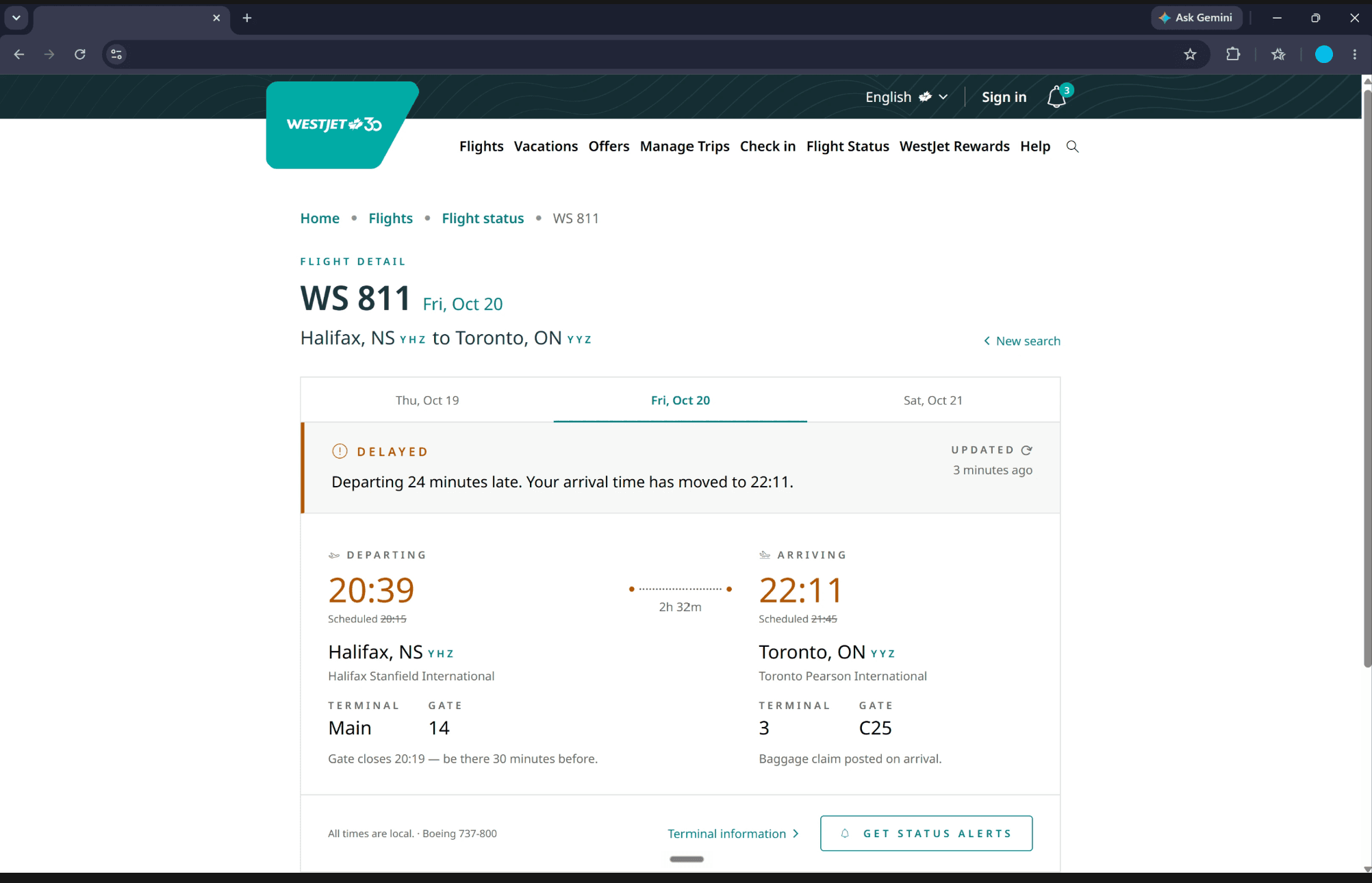
WestJet's existing Flight Status presents departure and arrival times, a status label, and gate information. But in case of a delay or a cancellation the experience doesn't shift to match. Revised and original times appear side by side without clear visual weight. The cancelled state looks structurally identical to on-time. Secondary information competes with what passengers need most.
WestJet's existing Flight Status presents departure and arrival times, a status label, and gate information. But in case of a delay or a cancellation the experience doesn't shift to match. Revised and original times appear side by side without clear visual weight. The cancelled state looks structurally identical to on-time. Secondary information competes with what passengers need most.
WestJet's existing Flight Status presents departure and arrival times, a status label, and gate information. But in case of a delay or a cancellation the experience doesn't shift to match. Revised and original times appear side by side without clear visual weight. The cancelled state looks structurally identical to on-time. Secondary information competes with what passengers need most.
THE problem
WestJet Flight Status gives passengers the latest
flight details, but still leaves them to interpret what changed,
how it affects their journey, and what to do next.
WestJet Flight Status gives passengers the latest flight details,
but still leaves them to interpret what changed, how it affects their journey, and what to do next.
WestJet Flight Status gives passengers the latest flight details, but still leaves them to interpret what changed, how it affects their journey,
and what to do next.
the redesign
Same information, but better
hierarchy and disruption communication.
Same information, but better hierarchy and disruption communication.
Same information, but better
hierarchy and disruption communication.
The redesign restructures Flight Status around four levels of information:
Current state → What changed → Current flight details → Passenger action
The redesign restructures Flight Status around four levels of information:
Current state → What changed → Current flight details → Passenger action
The redesign doesn't introduce a new visual system. It uses WestJet's existing design language and re-organises the information around what passengers need next.
The redesign doesn't introduce a new visual system. It uses WestJet's existing design language and re-organises the information around what passengers need next.
The redesign doesn't introduce a new visual system. It uses WestJet's existing design language and re-organises the information around what passengers need next.
What changes is structure: which information leads, what gets demoted, and what actions appear based on how disruptive the flight state actually is.
What changes is structure: which information leads, what gets demoted, and what actions appear based on how disruptive the flight state actually is.
Flight Status: Search Entry
Start with the search that fits the task
Start with the search that fits the task
Start with the search that fits the task


Flight detail
Know what changed and what it means
Know what changed and what it means
Know what changed and what it means


state system
Confirmation, recalculation, recovery:
the design responds to what passengers need.
Confirmation, recalculation, recovery:
the design responds to what passengers need.
Confirmation, recalculation, recovery:
the design responds to what passengers need.
Flight Status has one job: surface what matters most right now. As the flight state changes, so does the passenger’s priority. I focused the redesign on three core states: On time, Delayed, and Cancelled.
Flight Status has one job: surface what matters most right now. As the flight state changes, so does the passenger’s priority. I focused the redesign on three core states: On time, Delayed, and Cancelled.


key product desicions
Three product calls that defined the redesign.
Three product calls that defined the redesign.
Three product calls that defined the redesign.
Each decision below addresses a specific gap in the existing experience.
Each decision below addresses a specific gap in the existing experience.
Each decision below addresses a specific gap in the existing experience.
DECISION 01 • Search Entry
Separating flight-number and airport search into two focused entry paths
Separating flight-number and airport search into two focused entry paths
Separating flight-number and airport search into two focused entry paths
Flight Status supports two distinct retrieval tasks: searching by flight number or browsing by airport.
The redesign separates the two entry modes into tabs inside a single search card. Each tab shows only the fields relevant to that task. A Recently Viewed panel surfaces repeat access without cluttering the primary search flow.
The redesign separates the two entry modes into tabs inside a single search card. Each tab shows only the fields relevant to that task. A Recently Viewed panel surfaces repeat access without cluttering the primary search flow.
The redesign separates the two entry modes into tabs inside a single search card. Each tab shows only the fields relevant to that task. A Recently Viewed panel surfaces repeat access without cluttering the primary search flow.
Focus vs. immediate access
Focus vs. immediate access
Focus vs. immediate access
Tabs add one extra step if users enter through the wrong path, but remove competing fields and reduce unnecessary scanning increasing task focus.
Tabs add one extra step if users enter through the wrong path, but remove competing fields and reduce unnecessary scanning increasing task focus.
original

Identified tension
Flight-number search and airport browsing stacked vertically -> no focused path.
redesign

Design rationale
Tabs keep each path focused, showing only the inputs needed for that task while reducing unnecessary scanning.
A lightweight Recently Viewed area supports repeat checks without competing with the primary search flow.

DECISION 02 • Plain-language delay summary
Communicating the change, not just the status
Communicating the change, not just the status
Communicating the change, not just the status
A Delayed label signals a problem, but not its magnitude or impact. Showing 20:39 beside Scheduled 20:15 still asks passengers to work out the difference themselves.
A Delayed label signals a problem, but not its magnitude or impact. Showing 20:39 beside Scheduled 20:15 still asks passengers to work out the difference themselves.
The redesign adds a plain-language summary above the times: "Departing 24 minutes late. Your arrival time has moved to 22:11." The raw values remain visible for verification.
The redesign adds a plain-language summary above the times: "Departing 24 minutes late. Your arrival time has moved to 22:11." The raw values remain visible for verification.
The redesign adds a plain-language summary above the times: "Departing 24 minutes late. Your arrival time has moved to 22:11." The raw values remain visible for verification.
System simplicity vs. immediate comprehension
System simplicity vs. immediate comprehension
System simplicity vs. immediate comprehension
A change summary must stay synchronized with schedule updates. In return, passengers understand the delay and its downstream impact without interpreting raw timestamps.
A change summary must stay synchronized with schedule updates. In return, passengers understand the delay and its downstream impact without interpreting raw timestamps.
original

Identified tension
Labels such as Delayed establish the state but do not explain the difference between the passenger's expectation and the current reality.
redesign

Design rationale
Passengers no longer have to mentally compare operational values before understanding their situation.
The interface performs the comparison and lets the passenger focus on its consequence.
DECISION 03 • Cancelled State
When a flight is cancelled, the panel's job flips from monitoring to recovery.
When a flight is cancelled, the panel's job flips from monitoring to recovery.
When a flight is cancelled, the panel's job flips from monitoring to recovery.
On-time and delayed states help passengers monitor a journey. Cancellation changes the task: the priority becomes understanding what happened and where to go next.
On-time and delayed states help passengers monitor a journey. Cancellation changes the task: the priority becomes understanding what happened and where to go next.
On-time and delayed states help passengers monitor a journey. Cancellation changes the task: the priority becomes understanding what happened and where to go next.
The redesign moves Manage Trips and Advisories forward, while the original schedule remains as muted reference. Gate and terminal details recede because they no longer help the passenger act.
The redesign moves Manage Trips and Advisories forward, while the original schedule remains as muted reference. Gate and terminal details recede because they no longer help the passenger act.
The redesign moves Manage Trips and Advisories forward, while the original schedule remains as muted reference. Gate and terminal details recede because they no longer help the passenger act.
guidance vs. product boundary
guidance vs. product boundary
Flight Status can guide recovery without claiming ownership of rebooking, refunds, or eligibility. It points passengers to trusted recovery surfaces instead.
Flight Status can guide recovery without claiming ownership of rebooking, refunds, or eligibility. It points passengers to trusted recovery surfaces instead.
redesign

Design rationale
Once a flight is cancelled, monitoring is no longer the user’s primary task; finding a credible next step is.
Manage Trips and Advisories provide a clear handoff without implying recovery actions Flight Status cannot determine.


RESPONSIVE ADAPTATION
Critical flight updates need to stay
accessible on the go.
Critical flight updates need to stay accessible on the go.
Critical flight updates need to stay
accessible on the go.
Flight Status is inherently an on-the-go utility. The redesign extends the same core status, timing, and action cues to mobile so critical updates remain easy to check throughout the travel day.
Flight Status is inherently an on-the-go utility. The redesign extends the same core status, timing, and action cues to mobile so critical updates remain easy to check throughout the travel day.
Flight Status is inherently an on-the-go utility. The redesign extends the same core status, timing, and action cues to mobile so critical updates remain easy to check throughout the travel day.
AI-assisted workflow
I adopted an AI-native workflow to move from exploration to working prototype faster.
I adopted an AI-native workflow to move from exploration to working prototype faster.
I adopted an AI-native workflow to move from exploration to working prototype faster.
Started in Figma, then moved into Claude Design with a reconstructed WestJet design system for faster iteration. ChatGPT turned product decisions into precise prompts and constraints, and the final flow was tested as a working HTML prototype.
Started in Figma, then moved into Claude Design with a reconstructed WestJet design system for faster iteration. ChatGPT turned product decisions into precise prompts and constraints, and the final flow was tested as a working HTML prototype.
Started in Figma, then moved into Claude Design with a reconstructed WestJet design system for faster iteration. ChatGPT turned product decisions into precise prompts and constraints, and the final flow was tested as a working HTML prototype.
figma
figma
Rough explorations
Rough explorations
Dembrandt +
Claude Design
Dembrandt + Claude Design
Design-system reconstruction + UI iteration
Design-system reconstruction + UI iteration
ChatGPT
ChatGPT
Prompt specification
Prompt specification
Claude design +
cLAUDE CODE
Claude design + cLAUDE CODE
Targeted refinement
Targeted refinement
html PROTOTYPE
html PROTOTYPE
Experience + validate in context
Experience + validate in context
Claude design +
cLAUDE CODE
Targeted refinement
html PROTOTYPE
Experience + validate in context
intentded outcomes
What success would look like for the redesigned flow.
What success would look like for the redesigned flow.
What success would look like for the redesigned flow.
Success could be measured against these factors:
Success could be measured against these factors:
Success could be measured against these factors:
Status comprehension
Status comprehension
Status comprehension
Can passengers correctly identify the flight's current state?
Can passengers correctly identify the flight's current state?
Can passengers correctly identify the flight's current state?
Measures whether the current flight state is immediately clear without passengers having to interpret supporting details.
Measures whether the current flight state is immediately clear without passengers having to interpret supporting details.
Change comprehension
Change comprehension
Change comprehension
Can they correctly explain what changed?
Can they correctly explain what changed?
Can they correctly explain what changed?
Tests whether passengers understand what changed from the original schedule and how that change affects their journey.
Tests whether passengers understand what changed from the original schedule and how that change affects their journey.
Time taken
Time taken
Time taken
How quickly can they find critical information?
How quickly can they find critical information?
How quickly can they find critical information?
Measures how quickly passengers can locate the critical information they need, especially during delays or other disruptions.
Measures how quickly passengers can locate the critical information they need, especially during delays or other disruptions.
Next-action clarity
Can passengers identify the appropriate next step?
Tests whether passengers can identify what to do next when the flight state requires action, such as a cancellation.
Next-action clarity
Next-action clarity
Can passengers identify the appropriate next step?
Can passengers identify the appropriate next step?
Tests whether passengers can identify what to do next when the flight state requires action, such as a cancellation.
reflections
Here's what I would validate next.
Here's what I would validate next.
Here's what I would validate next.
This redesign reinforced that information hierarchy in a travel product cannot remain static when the passenger's situation changes.
This redesign reinforced that information hierarchy in a travel product cannot remain static when the passenger's situation changes.
The most useful intervention was not adding more flight information, but determining which information deserves attention at each moment.
The most useful intervention was not adding more flight information, but determining which information deserves attention at each moment.
The most useful intervention was not adding more flight information, but determining which information deserves attention at each moment.
Before shipping, I would validate three areas more deeply:
Before shipping, I would validate three areas more deeply:
Operational coverage
Operational coverage
Whether the proposed hierarchy works across additional real WestJet states beyond the three states represented.
Whether the proposed hierarchy works across additional real WestJet states beyond the three states represented.
Data availability
Data availability
Which change comparisons and contextual actions can reliably be supported by WestJet's existing systems.
Which change comparisons and contextual actions can reliably be supported by WestJet's existing systems.
Real travel conditions
Real travel conditions
The interface alone could not prove medical accuracy or safety. The challenge was positioning Clairo as useful without implying clinical validation or presenting it as a replacement for professional care.
The interface alone could not prove medical accuracy or safety. The challenge was positioning Clairo as useful without implying clinical validation or presenting it as a replacement for professional care.