end to end
ai-assisted
HEALTHCARE UX


TIMELINE
Nov 2025 - Feb 2026
4 months
role
Sole Product Designer
Self-initiated Project
Scope
end to end product design
mobile ux
ux research
BRAND IDENTITY
TOOLS
Design, Ideation, Prototyping, Polish

Perplexity
Research
Notion
Notes & Documentation

Claude
UX Copy Writing
THE current LANDSCAPE

THE problem
the solution preview
describe your concern
Describe symptoms in your own words, or use the symptom description guide to structure what you want to share.
Build context
Answer quick follow-up questions to build context, or type to add more detail.
Interpret the guidance
View possible explanations, recommended next steps, and warning signs in a clear, structured response.
connect with care
Get a care option recommended based on your symptoms, their urgency, and the level of support you may need.
RESEARCH & Discovery
user interview insights
users
users
users
market landscape
This study pointed to a clear direction: a symptom guidance experience that brings together flexible yet structured input, room to explain nuance, calm AI interaction, clear risk framing, and next-step support, without making users feel trapped in a questionnaire or overwhelmed by possibilities.
user behaviour synthesis
I mapped the journey from symptom awareness to care decision-making to identify where users lost clarity, confidence, or control. The map revealed that users were not missing information. They were carrying the burden of interpreting risk, judging trust, and deciding what to do next across disconnected touchpoints.





CONSTRAINTS & design guardrails
01
Explain possibilities and patterns, not conditions as confirmed diagnosis.
02
Surface red flags clearly without making every symptom feel like an emergency.
03
Make sources, AI limitations, privacy cues, and escalation paths visible.
The hardest design challenge was accepting that trust in AI healthcare has a limit. Users carry valid hesitation, and the product needed to respect that rather than push past it.
I focused not on eliminating doubt completely, but on designing around it: a system that respected doubt, made its limits visible, and gave users a safer path forward.
product evolution
The journey map showed where users needed support. The guardrails defined what Clairo could responsibly deliver.
I brought them together in a connected flow that safely guides users from symptom description to interpretation, evidence, and appropriate care.
Part 01 • core MVP FLOW
Clairo began as a broad AI health assistant, but early explorations exposed a scope problem: the product was expanding before its core symptom-guidance journey was fully resolved.
Strengthen one end-to-end symptom-guidance journey before expanding into adjacent health workflows.
Medication support, report analysis, family profiles, care integrations,
in-app booking, and monetization.


Early explorations tested broader home-screen models, direct chat, and guidance-first entry.
The final direction removed competing paths and clarified the hierarchy: direct symptom entry stays primary, while guidance remains available for users who need help describing their concern.
Flexibility vs. structure
Users need open-ended input to capture symptom nuance, while structured prompts help gather relevant context consistently.
Speed vs. intentional friction
Rapid entry reduces initial friction, while intentional pacing creates room to clarify key symptom details and warning signs before responding.
Final decision: Keep entry friction low, preserve flexible input while introducing structure when required, and slow down to gather context progressively.
EARLY chat entry & HOME-SCREEN EXPLORATIONS

01 - Competing capabilities
Multiple capabilities at entry diluted the core symptom task
Voice was given primary weight
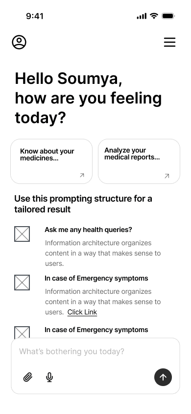
02 - Guidance-heavy entry
Guidance became dominant, slowing users who were ready
Added cognitive load upfront

03 - Chat-first, weak orientation
Direct entry into the chat weakened the home screen
Dominant prompt guide button
chosen direction

04 - Focused & guided entry
A clear primary task to start the chat, with a stronger hierarchy
Guidance stays secondary
Early explorations tested different ways to frame possible explanations, and risk without implying diagnostic certainty.
For the in-chat response, I prioritised layered, bite-sized information over completeness, keeping essential guidance easy to scan while deeper context remains available on demand.
information density vs. DIGESTIBILITY
Users require enough detail to understand the guidance, while still being able to interpret the response quickly under stress.
REASSURANCE vs. APPROPRIATE CAUTION
The response needed to stay calm without minimising risk, while keeping warning signs and escalation clearly visible.
Final decision: Use relative likelihood for explanations, then organise the response into layered, easy-to-scan sections that prioritise explanations, next steps, and escalation.

01 - Probability-led explanations
Exact percentages created a false sense of diagnostic precision that introduced medical liability.


Low risk response - green
Medium risk response - yellow
High risk response - red
02 - Risk-based response
Risk is presented first, with suitable semantic treatment which disrupted the hierarchy. High-risk cases need much earlier escalation.
chosen direction

03 - Layered response hierarchy
“Most likely” signals prioritisation without false precision, while a layered hierarchy clarifies explanations, next steps, and escalation.
Part 03 • design direction
These principles translated the design explorations into a cohesive framework, balancing clinical safety with intuitive user interaction.
01
Prioritize immediate symptom description over multiple features, while offering optional support for users who need help to get started.
02
Use follow-up questions in chat to gather required context, preserving open-ended flexibility while steadily sharpening triage precision.
03
Structure the response in clear, layered sections, keeping risk visible without letting it dominate the experience.
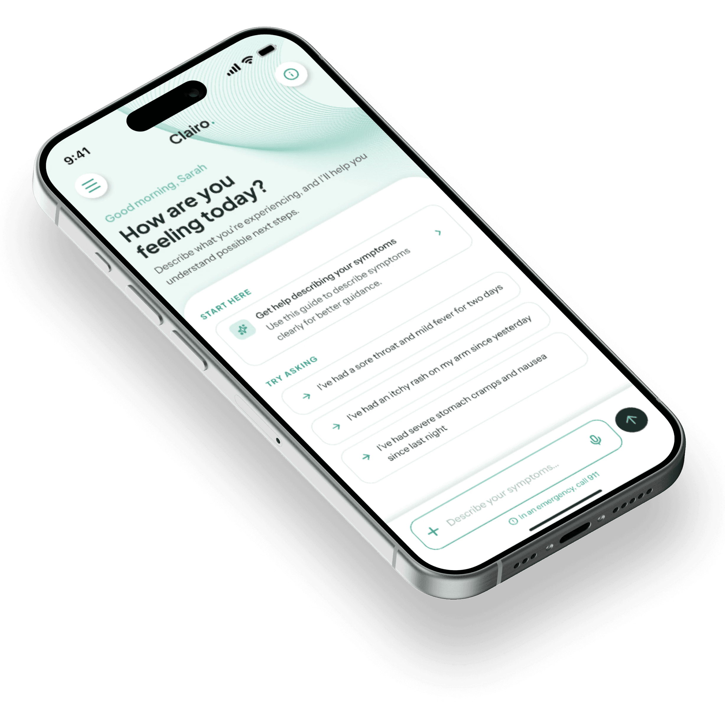
visual psychology

prototype testing & validation
5
Users
Method: Moderated remote usability testing with a clickable mobile MVP prototype.
Main task: Headache symptom-check scenario, think aloud session.
Screens: Chat entry, prompt guide effectiveness, AI chat flow, symptom summary and care options.
What I was watching for
Rather than task completion alone, I observed how users interpreted the guidance, where they hesitated, what earned or weakened trust, and whether they could identify an appropriate next action.
What the prototype validated
What this changed in my thinking
iteration 1
before


The inline source link was less visible and easy to miss.
Discarded direction

Source chips increased visibility but competed with the guidance.
chosen direction

A dedicated and well-defined source row improved visibility.
I tested a stronger source treatment, but the added visual weight competed with the guidance. The final design gives sources a dedicated place while keeping the response calm and easy to scan.
iteration 2
before

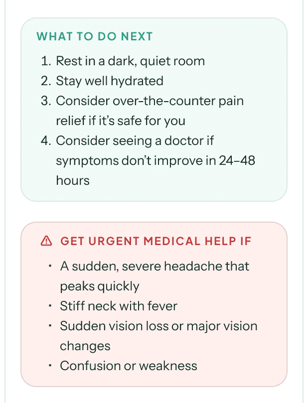
The urgent-care warning competed with the next step guidance.
after


Made next steps prominent, and softened urgent-care emphasis.
I reduced the visual dominance of the urgent-care panel so users could focus on the most relevant next steps, while preserving clear access to safety-critical guidance.
testing insight

final solution
intervention 01 • guided symptom input
identified friction
When distressed, users struggled to identify and communicate the symptom details that mattered.
Product decision
Added an optional symptom description guide to reduce the burden of structuring the symptom clearly.
home screen & chat entry
Easy starting point
Examples broaden what feels askable, removing pressure to phrase the first message.
Immediate chat entry
Users can begin describing the symptoms directly without opening a separate chat screen.
Guidance without friction
The guide stays secondary, offering structure without slowing the path to chat.

Guided symptom description

Structured symptom cues
Cue cards surface relevant details and examples without forcing users into a fixed format.

Describe as you go
The persistent input bar keeps guidance visible while users describe their symptoms.
identified friction
Users had to interpret dense guidance while already anxious, making the next step harder to identify.
Product decision
Guidance is layered for calm, scannable interpretation: concise in chat, detailed on demand.
IN-CHAT SUMMARY

Response starts by summarizing what the user shared so they can verify the context first.

Recommended actions are highlighted, prompting users towards actionable guidance.
Detailed symptom summary

The summary can be saved, shared, and updated as the concern evolves.
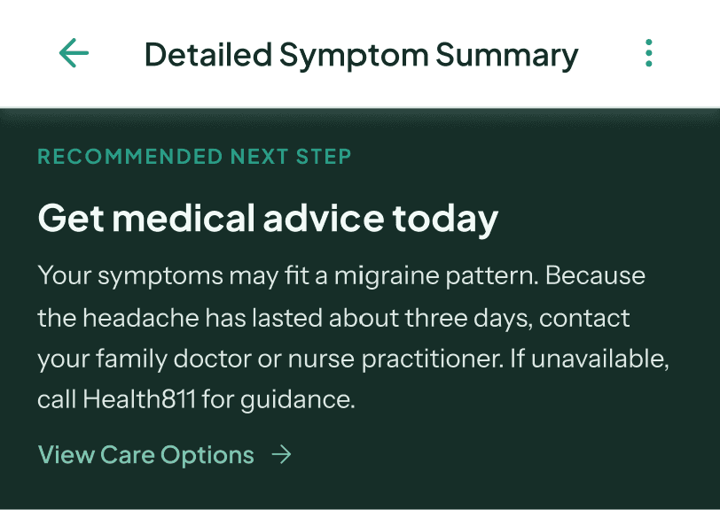
Opens with the recommended next step, then explains the symptoms and guidance behind it.
identified friction
Users needed visible evidence and boundaries to judge how far they could rely on AI guidance.
Product decision
Made source credibility, review dates, and clinical limits visible at the point of interpretation.
RESPONSIBLE AI FOUNDATION
Clairo’s proposed AI layer retrieves information from a curated clinical knowledge base so guidance can be traced to trusted sources. Retrieval improves traceability, but does not guarantee medical accuracy, so uncertainty and clinical boundaries need to remain explicit.
SOURCE DETAILS
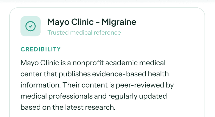
Gives users the context to judge a source’s credibility without relying on prior knowledge.

Review dates help users judge how current the information is.
trust signals across the journey

Follow-ups explain why each question matters, keeping users informed about
how the system is reasoning.
— AI symptom chat

A concise boundary note defines Clairo’s role and clarifies that the guidance is not a diagnosis.
— detailed summary

Sources stay attached to each explanation, keeping evidence close to the claim.
— detailed summary
identified friction
Users struggled to identify the right care option and move forward with confidence.
Product decision
Prioritized one care path, kept alternatives visible, and enabled summary sharing to preserve context.
CARE OPTIONS

The most appropriate care route leads, rather than presenting every option equally.

Phone actions, service discovery, and summary sharing avoid overpromising booking integrations for MVP.
DESIGN IMPACT & RISK MITIGATION
Design response
intended impact
Design response
intended impact
Design response
intended impact
Design response
intended impact
What still needs validation
The design reduces important experience risks, but clinical safety, equitable performance, privacy, and real-world care outcomes would require further validation before Clairo could responsibly scale.
challenges faced & lessons learned
Protecting the core MVP
Clairo conceptually expanded beyond the core flow into booking, virtual care, family profiles, and monetization. The challenge was separating what strengthened the core journey from what introduced dependencies the MVP could not responsibly support.
I learned that product strength comes from identifying and removing competing features before they weaken the experience.
Communicating risk without causing panic or false confidence
I had to make the experience feel supportive and trustworthy without minimizing warning signs or making the AI appear more certain or clinically capable than it was.
This reinforced that in healthcare, language, tone, hierarchy, and safety must be designed as one system.
Building credibility within real-life clinical constraints
The interface alone could not prove medical accuracy or safety. The challenge was positioning Clairo as useful without implying clinical validation or presenting it as a replacement for professional care.
This taught me to treat honest limitations as part of responsible product design.
FUTURE SCOPE
CLINICAL READINESS
Before expansion, Clairo would require clinician review of triage logic, clear intended-use boundaries, privacy and consent design.
CARE INTEGRATION
Move from external links to integrated provider search, booking, virtual care, and secure summary transfer through healthcare partnerships.
CONTINUITY OF CARE
Add follow-up check-ins, symptom history, and caregiver profiles once the care handoff is reliable and the core guidance flow is validated.
Keep symptom guidance, emergency escalation, source transparency, and public care pathways accessible.
Revenue can grow through partner-enabled virtual care, family and continuity tools, and B2B licensing to clinics, employers, or health networks.
This keeps monetisation separate from safety-critical guidance and ties revenue to expanded care access and continuity.